watercolor, 2016
available, 9"x12"
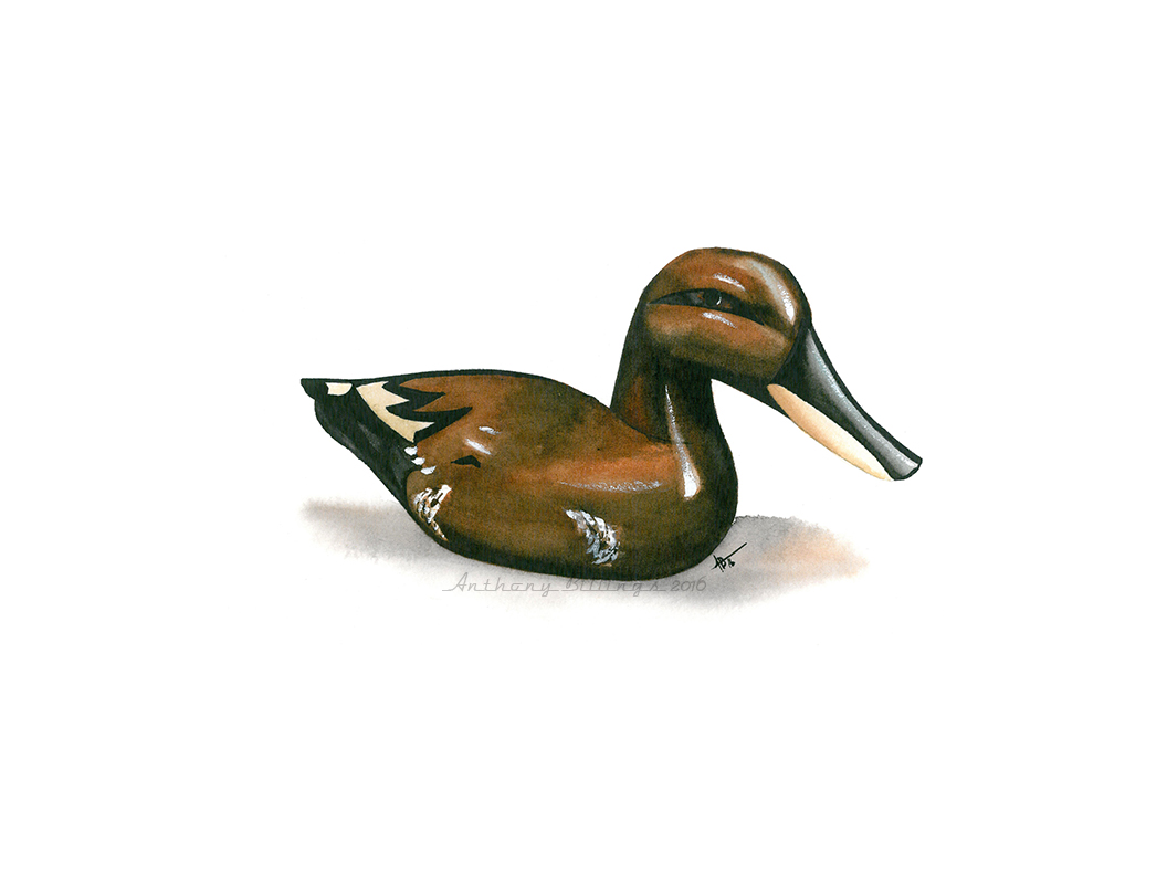
I decided to continue a sporting theme after the success of Lady Bug last week. Right now it's just fishing lures and duck decoys, but I might expand to other subjects when I get tired of ducks and plastic "fish." These are fun to do. At this size I can complete one in a couple hours. I'm also seeing a welcome fusing of realism and impressionism in spots, the "calligraphy" and "suggestion" many more accomplished artists talk about. Another interesting rabbit hole to head down.
And, if I don't see you again before Saturday, have a happy new year!
watercolor, 2016
available, 9"x15"
Hardly the festive, seasonal subject matter most people are doing this week. Just a little still life of a fishing lure. This was a quick, fun way to burn a little time and it turned out quite nicely. I'll probably do some more of these.
I hope everyone has a very merry Christmas!
watercolor, 2016
available, 11"x15"
I've done a few neon signs in the past. Most of them -- the successful ones, anyway -- were done large and as realistic as possible. So, I wasn't sure about doing this one only 11"x15" and allowing some leeway with edges and color and blooms. My biggest problem when I'm in the painting process is not standing back and looking at the "big picture," or considering the painting as a whole. I'm always too close looking at and painting details. Part of impressionism and loosening up in general is taking in the big picture, suggesting instead of showing. Precise detail painting is "showing." Suggesting is about giving the viewer the idea of a thing and letting them fill in the details. That's the place I'm going. It's funny how a realist painting with plenty of what look like details reminded me of this. But, some of those "details" actually are just suggestions, a mark here, a dry-brush stroke there.
mixed, 2016
available, 11"x15"
Virtual Paintout is in Montenegro this month. This is as close as Google Maps Street View gets to this small church on a hill at the center of an island. But I liked the view with the walled dirt road leading in.
watercolor, 2016
available, 11"x15"
This is from a reference photo I took in Charleston last year. I'm beginning to think I should have taken more shots of the horse-drawn carriages. To me, at least, they seem quite dynamic in these otherwise fairly static streetscapes.
watercolor, 2016
available, 11"x15"
An early morning scene behind a building in downtown Salisbury, NC. I was scheduled to take my daughter to breakfast one morning and went early to grab some photos of Salisbury's paint-ready downtown. I wanted to go loose, but I'm afraid I might have gone too far to the Primitive/Amateur side of "loose" on this one.
watercolor, 2016
available, 11"x15"
This has nothing to do with the one from a couple weeks ago. The reference photos were taken 4-5 miles and 2-3 years apart. Still playing with leading lines and vignetting. I'm not sure the vignette works with this one.
watercolor, 2016
available, 11"x15"
A very loose impression of a photo of a particular area of (I think) Chicago in the early 1970s.
watercolor, 2016
available, 11"x15"
I'm abstracting just a bit in this one leaning toward impressionism. But, not enough. I might need to return to this spot for more reference photos.
watercolor, 2016
available, 11"x15"
This is from a photo I shot in Old Salem, a preserved Moravian town first settled in 1766. I couldn't resist the shadows on the building when I saw it a few years ago. Even then I knew it would be a challenge to paint and this is at least the second attempt. I'm much happier with this one than with the first.
watercolor, 2016
available, 11"x15"
This is from a photo I took on the Dan River back in June and the second attempt at painting it. The first time I tried this one, I overworked the foreground shore multiple times. So, this time I left it white to vignette only the line marking where the water and sand meet. That didn't seem to work, either. It was far too bright. So, I added in the abstract color you see now. Maybe it's done now.
watercolor, 2016
available, 11"x15"
This was painted from a cell phone photo I took as we were moving my sister out of her house earlier this year. And, it's nice timing as we're in the process of moving my daughter into her first apartment.
A moderate mixture of detail and looseness, I'm very happy with some spots, just "happy" with some others and I settled for a few spots. The biggest problem with this really was that it was painted on Kilimanjaro paper from Cheap Joe's. I don't care for that paper; it buckles much more than Arches and even the cheaper Moulin du Roi by Canson. The only good thing about it is the texture. The cold-pressed finish is much rougher than any other brand I've tried.
charcoal, 2016
available, 8"x10"
My daughter recently reminded me it's been a while since I added to my horror character series and I was way behind. So, here's everyone's favorite possessed doll. Happy Halloween!
ink, 2016
nfs, 8"x11"
Just a quick ink sketch I did of great American horror writer Edgar Allan Poe. And, yes, if you haven't noticed before, his face - eyes especially - is definitely NOT symmetrical. None are; his is just really obvious.
watercolor, 2016
available, 11"x15"
I haven't done one of these in a while. A pair of my wife's shoes -- one of the many. A somewhat looser treatment than usual.
watercolor, 2016
available, 11"x15"
Virtual Paintout is in Newfoundland this month. I couldn't pass up this view.
watercolor, 2016
available, 11"x15"
The Cape Hatteras Lighthouse as seen from the Keeper's House. I shot the reference for this during our trip to the Outer Banks last year. I'm quite happy with this one -- even the sky, though the scan washed out much of it. The only thing I would do differently is add a touch more warm color in the lighthouse shadow near the bottom. And maybe one more person closer to the foreground.
watercolor, 2016
nfs, 7"x11"
Another portrait of my beautiful bride. I've very happy with how the shadows on her face and reflections on her sunglasses worked. The reference photo was taken by her BFF several years ago on a girls outing to the Grove Winery in Gibsonville NC, a one-time favorite haunt of theirs.
watercolor, 2016
This is from a photo I took in downtown Asheboro NC a couple years ago. Again, another problem sky. But almost everything else - including the tree(!) - worked out pretty nicely. Even worse than the sky, though, is the overhead walkway crossing the street between buildings - that white mass on the far right. You just can't tell what that is here. Oh well.
watercolor, 2016
nfs, 7"x11"
Those pearl earrings make another appearance in this much looser portrait of my wife. The reference photo for this one was taken when my wife was in a friend's wedding just a few weeks after finding out she was pregnant with our first child. She truly was glowing. I just wish I could capture how beautiful she really was that night - and still is.
watercolor, 2016
This is a family that was sitting the next table over while my wife and I were enjoying some live music at The Grove Winery in Gibsonville NC a couple months ago. I took some chances with several spots in this painting. The things I like about this one outnumber the things I wish I'd done differently. So, I'll call that a reasonable success.
watercolor, 2016
available, 9"x12"
Here's that second church from Lancaster PA for Virtual Paintout I mentioned last week. Very quick, very loose and impressionistic.
watercolor, 2016
available, 9"x12"
Virtual Paintout is in Lancaster County, PA this month. Lots of farmland and wide, open spaces. I always seem to gravitate to church buildings. This simple, little church is out in the middle of nowhere. I might do a gothic church from downtown Lancaster, as well. This one worked out nicely. I wish the little graveyard behind the church was more apparent. I could have gotten a closer vantage point or one from camera-left. But that would have either reduced the feeling of space or removed the straight-ahead frankness these little churches exude. The only other problem is that the scan washed out a sky with which I'm actually very happy.
watercolor, 2016
nfs, 7"x11"
Here's another small one that was supposed to be a color test that drew me in and I couldn't help myself. Like so many photos of my wife, I've drawn or attempted to paint this one several times. This is the best attempt at this one to date.
Here's what my daughter posted on Facebook when she shared this image on her page:
I just want y'all to know that my house is absolutely covered in
portraits of
my mother and my brother and I that my dad has created. The
evidence of
his love literally surrounds us. This is what I strive for.
He has found his own
way of showing us how much he loves us and to walk
into that house is a truly
remarkable thing.
What could I possibly add to that?
watercolor, 2016
available, 11"x15"
I've had this reference photo so long I don't remember where it came from or who shot it. I was never quite sure how to tackle it or if I could do it justice. I think it works pretty well now.
pencil, 2016
nfs, 8"x11"
This is just another sketch for a painting based on a particular reference photo. I've been putting off starting the painting while doing some color testing as referenced a couple weeks ago. I'll get to the painting eventually.
watercolor, 2016
available, 11"x15"
There isn't much to say about this one. It's from a photo I took a couple years ago. Until recently I didn't think it had much to offer as a painting. I'm glad I proved myself wrong.
watercolor, 2016
nfs, 7"x11"
My favorite model again in what were her favorite earrings and one of my favorite outfits ;) This one is small because it was meant to be a color test to check a particular color combination for flesh tones. It worked so well - and I got so caught up in painting my wife - I ended up with a very polished, finished portrait. Not a bad couple hours.
watercolor, 2016
available, 11"x15"
I guess I'm a glutton for punishment with all the angles and shapes on this church in Norway. But I couldn't pass it up for Virtual Paintout this month. Of course, there are things I'd modify - but only slightly. So, I'm pretty happy with this one, especially since I seem to have hit most of the British Impressionism buttons.
watercolor, 2016
available, 11"x15"
The fashion now is to restore old trucks especially, but some cars, as well, to good running condition but leave the exterior paint and rust alone for a "vintage" look. These usually are sprayed with a few coats of clear-coat to arrest any further rusting or paint loss. I wasn't aware this was a thing until I saw it done on one of those car restoration "reality" shows. I have to admit I like the look - and it makes for a lot of great subjects to paint. My only problem is that the clear-coat makes the rust shine, which looks odd because rust doesn't shine. At least, it doesn't have to shine on my paper. This one worked out nicely, though a little darker than I meant to go with it.
watercolor, 2016
nfs, 9"x12"
I'm trying a new technique that I've admired for years but never spent much time trying to figure out. It involves layering colors in what on the surface seems abstract. But each layer and each color adds to the development of the image. In a way, you could say that description is accurate for a lot of watercolor. But this method is different. If you isolated just the yellow ochre in this piece, it wouldn't look anything like a portrait; that follows for most of the other colors. I'll consider this one fairly successful, though it's obvious I used cheap paper. But it is a sketchy experiment.
watercolor, 2016
available, 11"x15"
In a previous post I said I wanted to stay away from Angkor Wat in Virtual Paintout's Cambodia month because it seemed like an obvious choice. But, of course, I still wanted to explore the site a little in case there were views I just couldn't pass up -- like this one. Even more appropriate is the fact that the site opens extra early - 5 am - to allow tourists to catch the sunrise from the temple. Now, add to that the fact that I think I hit a loose, impressionist rendering of the scene spot on and I am as happy with this as I'm likely to get.
watercolor, 2016
available, 11"x15"
A scene obviously near Banner Elk, NC in the Blue Ridge Mountains.
watercolor, 2016
available, 11"x15"
A classic rv (or motor home or caravan depending on your location) now serves out its remaining days as an office for a junkyard (or waste re-assignment facility). Travco built their classic motor homes on Dodge chassis; that's where we get the disparity between the title and the poorly maintained Dodge badge on the front end. I'm especially happy with the reflection in the windshield; that worked out better than I intended.
watercolor, 2016
available, 9"x12"
Here's a quick sketch of a temple ruin in Cambodia for Virtual Paintout. I know everyone will be doing the temples this month. For VP I usually try to find the less obvious subjects. But, frankly, there are so many temples to paint with such pictorial appeal it's astounding. I easily could paint dozens of images here. And, hopefully, most people will stick to the more famous Angkor Wat area instead of venturing out to the lesser known temples.
watercolor, 2016
available, 11"x15"
Getting a little looser with my classic cars. Extremely rough Moulin du Roi paper doesn't hurt either. It's hard to be precise when the paper texture is like stucco. Clean water and paint spatter added some texture and interest to the grass, as well.
watercolor, 2016
nfs, 11"x15"
I'm especially happy with this one. It's from a photo I took of my wife years ago.I'm very happy with the looseness, paint handling and lost/found edges here. This one probably will end up on a wall in the house somewhere.
watercolor, 2016
available, 11"x15"
Another one from Charleston SC.
watercolor, 2016
available, 11"x15"
This easily could be in Tuscany instead of Napa Valley, California. The Castello di Amorosa is a castle and winery presumably authentic in (most) details near Calistoga CA. Virtual Paintout is in Napa Valley this month. I'm opting for this beautiful location because, try as I might, I just can't paint grape vines to my liking. I'm not even happy with these trees. That's part of the reason I've been on such a landscape bender the last year or so. I'm trying to get better at something I used to avoid.
Porta Del Castello
available, 9"x12"
This one is closer to my comfort zone. No trees, grass or sky to screw up. It's a bit smaller, done in a 9x12 sketch book. I've lately been using a watercolor Visual Journal from Strathmore. I like the cold-pressed texture and the general construction. It has very thick, stiff pressboard covers and is wire-bound to allow flat opening or flipping the forward pages completely under the page you're working on (like wire-bound composition books in school). This is Strathmore paper, though. And a SKETCH book. This paper can't handle too many layers or corrections. You need to get it right in two or three layers or just understand that sketches aren't meant to be finished masterpieces (though many can be). Beyond that, I like this paper for my uses better than some other brands.
watercolor, 2016
available, 11"x15"
This is from a stock photo I've been sitting on for years. The rough paper texture really made this one pop.
watercolor, 2016
available, 11"x15"
I played with the texture on this one a bit after I deemed in "finished" because I wasn't happy. So, clean water drops led to lifting out to create some light spots; white gouache added some white highlights; and some white china marker brought up some other areas I thought were too dark.
watercolor, 2016
nfs, 11"x15"
Painted from a shot of my wife with the paper spread out on the bed. Actually, she's much neater than this. I added 90% of the newspaper for the composition's sake. This one hits all the notes: loose, impressionistic, not too photographic, but recognizable, and most importantly, she likes it!
watercolor, 2015
available, 11"x15"
This is the third attempt at this image and I'm still not sure about it.
watercolor, 2016
available, 7"x11"
Just a quick, loose painting of something I saw every day growing up and still see once or twice a week. This fence post denotes the edge of my parents' back yard. The field beyond used to pasture a beautiful white horse when I was very young. Once the horse was gone, the fencing fell into disrepair and has looked like this for at least 40 years.
watercolor, 2016
available, 11"x15"
St. Anne's is a picturesque, old church in the eastern part of North Carolina. I wasn't too sure about this one until after I scanned it. I like it more now than I did before. But I still might try it again to add some more air around it. I think it's a little too crowded.
watercolor, 2016
available, 11"x15"
A street scene in Rockport, ME, another I found for Virtual Paintout this month. I'm very happy with this one. I hit just about all the notes for which I was aiming. This is very much the loose impressionism I've been struggling to develop. I'm not even going to mention the minor problems that usually fill these posts.
watercolor, 2016
available, 11"x15"
Just loose enough, I think. I liked the deep shadows across this yard in Rockport, ME.
watercolor, 2016
available, 11"x15"
When pedal cars were cool -- and metal -- and actually had pedals instead of electric motors.
watercolor, 2016
available, 8"x10"
Virtual Paintout is in Rockport ME this month. Lots to paint here. Started with this quick, loose doorway. I might do another view of this same house.