Just another "portal" painting. Portals -- in the form of doors and windows -- have been popular in art for centuries. I like the inherent mystery of wondering what's on the other side.
It's probably just a sense of nostalgia, but I have a soft spot for even these old full-size Jeeps. I'm sure if I actually drove one, I would feel like it was too big after driving a much smaller XJ Cherokee for years. But, I can't help wishing I'd been introduced to these way back when.
This was meant to be a quick, sketchy car painting. But, it turned into a much more realistic piece, though it still took just a few hours. Most of that was drying time for the several layers of red.
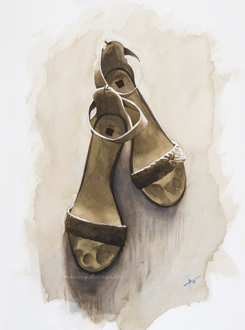
A still life of another pair of my wife's shoes. She buys shoes about as often as I buy brushes or paint and many of them are pretty sexy, visually appealing and worthy of paintings. The problem is I rarely take the time to shoot reference photos of them. And, before you know it she's worn them out or gotten tired of them and tossed them without me getting a chance to shoot them. So, last December when I was given a mandatory vacation from my job of 22 years I took the opportunity to shoot a bunch of her shoes for future paintings. I think this is the first pair I've painted, but there are more to come.
It's been a while since my last decoy painting. I experimented with leaving this one a bit looser and more impressionistic. A bit of Holbein's Grey of Grey straight from the tube - a very opaque watercolor - blended along the beak helped to bring out the contour and emphasize some dimensionality.
The occasional use of opaque pigments in otherwise "transparent" watercolor allows me to add a little sparkle on top of dry passages without resorting to gouache or gesso. Not that I'm above using gouache or gesso or anything else that works for a particular painting. But some people and many organizations still are quite picky about what you can and cannot use in a transparent watercolor. Some would even disallow the use of any opaque pigment if it's visible on top of a darker hue like this one. I don't want to get into a long, drawn out thing here. I don't like anyone trying to apply "rules" to art (though there's nothing wrong with placing limits on yourself as a self-challenge). But, I do try to start off with every intention of keeping a painting purely transparent even to the point that almost all of the colors on my regular palette are transparent or semi-transparent. Of course, things happen; every piece takes it's own twists and turns. In the end I always do whatever the piece warrants, not what some organization or academic demands.
In spite of the attempt at looseness, this classic car still looks pretty detailed. It also seems more darkly-toned than most of my car paintings. That wasn't really intentional. But the shadows in the reference photo were a little unusual. Maybe I captured a little atmosphere without knowing it.
Just an old Buick left to its own devices on the prairie. I used a little thinned gesso to knock back some of the color intensity in the bottom corners. I like the look of the gesso rather than just lifting with a wet brush. There's also a considerable amount of dry-brush to get the lightest grasses.
A quick, wet and loose wash of various blues gave me a tinted ground for this still life. Once that dried, all I had to do was paint in the shadows with a darker mix of blue. Having the image drawn out before the initial wash allowed me to leave a few spots lighter than the rest of the wash to allow for the brighter highlights. Those were accentuated a bit -- and the polka dots added -- with a little titanium white watercolor. Forget the "rule" about not using white in watercolor. The final image is the only rule that matters.
I painted this from a composite photo I put together from separate photos of the truck and barn. I'm very happy with how that process worked out. Too often the angles don't workout, or it's difficult to place the different objects on different planes so they don't look like they exist in the same space. And, then, of course, there's the lighting to work out. This one fell together nice and easy.
I'm not sure I've painted a Corvette in a while. Classic Corvettes are one of those cars I have to paint once a year or so because of how beautiful, popular and fun they are. So, I guess I've filled my quota for a while.
Just another little gouache shoe painting. I struggled with some of the reflections and highlights -- par for the course with me and gouache. But, I think I finally pulled it off.
I might have rushed the details on this one a bit. My father was an avid bass fisherman, so I've seen lures and all other manner of fishing equipment my whole life. But it wasn't until I started painting them that I realized just how much detail is put into making these things look as realistic as possible. I guess fish are smarter than we think. And, maybe the chrome hooks are actually invisible underwater.