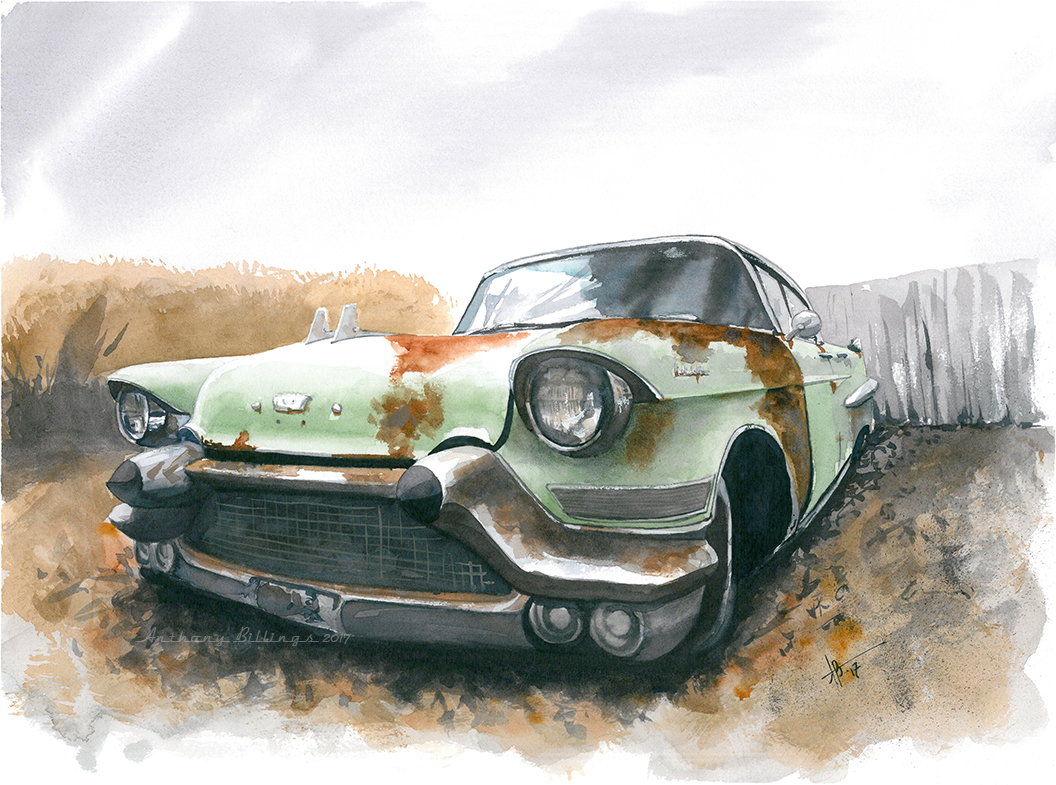
Another classic Cadillac with lots of shiny paint and chrome. I had some fun with this one finding ways to suggest more than show and still get plenty of detail and/or the appearance of detail, a skill I want to continue to enhance.
This one worked out a lot better than I thought it might. For some reason I struggled more than usual with this type of subject. Maybe it was the paper; I think this was a trial sheet of Lanaquarelle. Overall, I think I like the paper. But every paper takes some "getting-used-to." I might have had an easier time on Arches or Moulin du Roi.
Loosening up on car paintings always feels like a double-edged blade. I'm inclined to render cars photographically as I did for several years. But, as I've mentioned here before, I no longer want to be a camera; I want to interpret and paint loosely. So, sometimes I try to split the difference and render some parts tightly and some loosely. Baby steps. The grillwork on this one is loose partly out of necessity. If I were painting this on a full sheet or even a half, I might have been more exact in the execution of all that grill chrome. I've done it before. But, at this size I'm not sure my hand is that steady. So, we went loose and gave the impression of lots of chrome grill tines (for lack of a better word). The yellow is a factory color of the period, I think, though the original color probably wasn't so bright. The original isn't for sale because my daughter expressed an interest in it when it was still in progress -- mostly because her favorite color is yellow.
This probably should be called "Rusty Cadi Redux" because I've painted this particular image before - back in 2011 (Rusty Cadi). The original was auctioned off for the local United Way a few years ago. But I've always liked the reference photo and thought it would be fun to revisit it in a slightly looser style. So, here it is, though the style isn't much looser than the first attempt.
I got a wild hair recently to see if I could play with the logos/badges of various auto manufacturers and their products and drop a little impressionism/expressionism on them. It might make an interesting pop art series. Since I also recently bought a Cadillac (a VERY good deal on a used SRX that I couldn't pass up), I thought their latest logo crest would be a good place to start.
I found some Winsor & Newton Pigment Markers on clearance locally so I thought I'd give them a try. I just bought a couple grays as I've been wanting to experiment more with grayscale and with markers. This is a first attempt. Not bad if I say so myself. The two pens I chose were a bit darker than I expected. I was looking for four levels -- two grays, black and paper white. Not really what I got. Even so, they work nicely in a horror theme, obviously. I'll be playing with these some more for both finished pieces and preliminary grayscale sketches for watercolors.
I think the scan increased the contrast in a couple spots more than I like. The worst offender - the only spot that really bothers me - is the reflection in the car door. That's a lot lighter and more harsh than it is in real life. Other than that (and the grass which I'm never happy with) I'm quite happy with this one.